Homework
Below is the research findings of five logos: Disney, Warner Bros, Columbia Pictures, Paramount and MGM.
Disney
1985

- the words 'Walt Disney Presents' was changed later to 'Walt Disney Pictures'
1995
- in the 1995 logo, it included the 2D depiction of Cinderella's castle
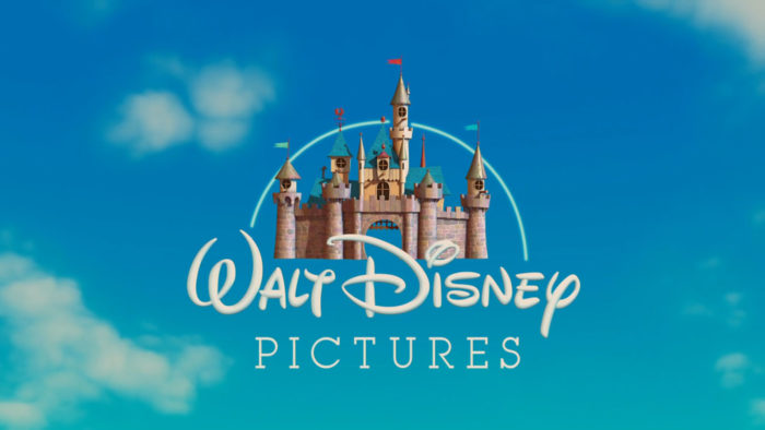
1998

- The logo became animated when Disney made an agreement with Pixar. The technological advancement of the logo shows how much Disney has advanced. It contained details such as moving flags, towers and balconies. There was the animation of a star drawing a line to link the letter 'Walt Disney Pictures' to the castle.
- Shows state-of-art graphics
-It used a recognizable font
2006
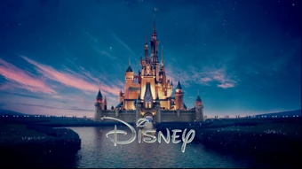
-Clouds and fireworks were included to increase feeling associated with dreaminess and excitement. It links with the imagery of Disney being a fantasy land.
Warner Bros
- Warner is the last name of the founders who are four Jewish brothers emigrated from Poland hence Bros
- the Warner Bros. shield is iconic (introduced in 1993). The details of the first logo of 1993 was highly detailed and difficult to use in digital context (using it in a smaller scale). The logo could not be used across various platforms and scale. In 2019, the logo was redesigned: the shield and letter monogram "WB" remained. The shield colour became a contemporary blue while the wordmarker was slightly darker to create a contrast.
- a dimensional version of the logo was created to be used exclusively for on-screen content. It would e used for the opening and closing moments of individual movies and shows and the logo would be customised to it. It would function as a window for imagery and sequences.
1923

1937

1999

2019
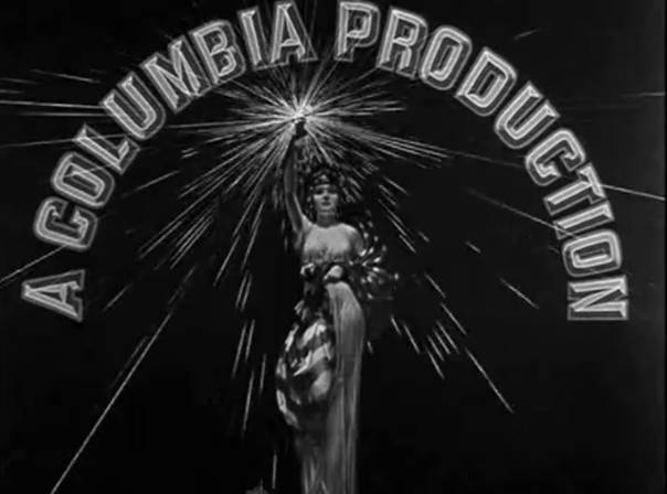
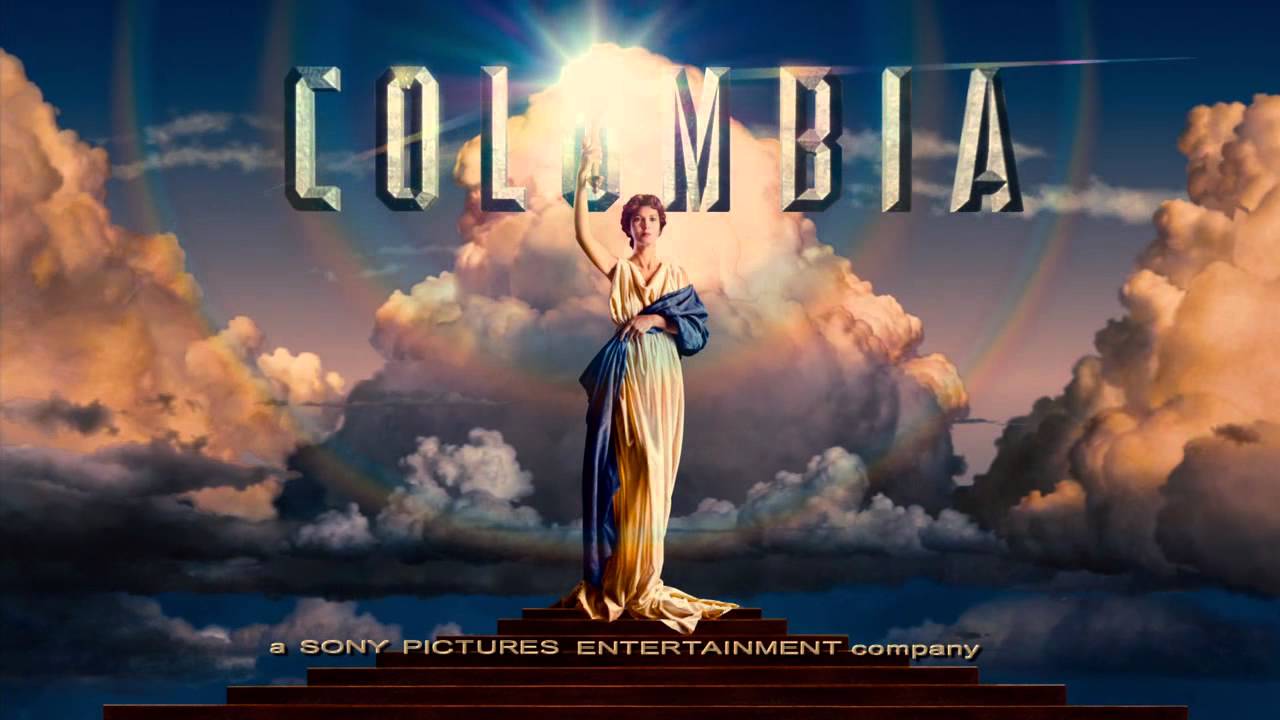
Columbia Pictures: The Torch Lady (1919)
- At first, it was nicknamed "Corned Beed and Cabbage" since it produced low-quality movies. In 1924, the studio was renamed Columbia Pictures Corporation to improve the image. The Logo is the "Torch Lady" which is the female personification of America. It was associated with the idea of enlightenment. Apparently, it used three models. In 1993, Michael J.Deas digitally designed the Torch Lady logo to the 'classic' lady. The model in this logo was Jenny Joseph. Designer Deas added computer-generated features to create a composite face of the model.
(Research below copied from myfilmview website with own observations added)
1924-1928
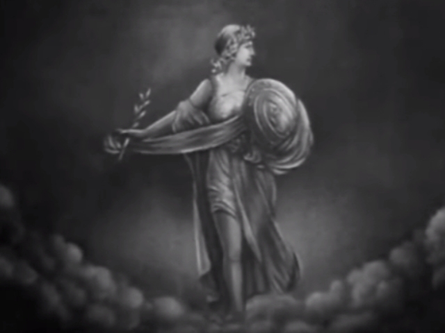
-Before the Torch lady appeared in 1928 the studio used the image of a female Roman Soldier holding a stick and a shield.
1928-1936
In this version, the Torch Lady had a headdress and had rays on the torch that flickered.
- in1933, Jeff Kleiser and Diana Walczak from Synthespian Studios used inspirations of 2D elements from paintings and converted it to 3D.
1936-1976

This updated version removed the headdress and a pedestal was added.
- In the 1940s a federal law was passed which stated that it was illegal to wear the American flag. There was a change from wearing a draped flag and holding a torch to wearing stola of ancient Rome- this is based on Evelyn Venable.
1961-1976

Although the image remained much the same a coloured widescreen version was introduced.
-The logo was animated by Robert Abel and was accompanied by a score composed by Suzanne Ciani.
1976-1980


Although this version started with the torch lady, it zoomed in on the rays of the torch to end with the stylised Columbia Pictures logo.
1981-1992

This version was similar to the previous one, although less detailed, with the stylised version shortly appearing before Columbia Pictures appeared.
1992-1998

In 1992 a new matte painting was made by artist Michael J. Deas. It was Jenny Joseph who was the model for this updated version. Deas created an oil painting based on her, which has been later digitised and animated. I was able to interview the artist about painting it.

1999

For their 75th Anniversary it showed a quick transition of the lady to the current version with “75th” appearing as well.
1999-now
Paramount: The Majestic Mountain
W.W Hodkinson drew the "Majestic Mountain" logo. It was based on his childhood of the Ben Lomond Mountain in Utah. The 24 stars of this original logo symbolised Paramount's 24 movie stars. Original matte painting was used and it is replaced with a computer-generated mountain and stars. Adolph Zukor and Frohman brothers: Daniel and Charles are founders of Paramount Pictures Corporation (1912)
Metro-Goldwyn-Mayer (MGM): Leo The Lion
In 1924, "Leo The Lion" was designed by studio publicist Howard Dietz. It was based on his alma mater Columbia University athletic team, the Lions. These were the five lions showing the progress of how the Columbia logo developed: Slats which features in film openings from 1924 to 1928 with silence; Jackie- growl sounds played on the phonograph while logo appeared on screen and appeared in technicolour in 1932; Tanner- the most famous lion; and Leo which has been used since 1957.

Logo Process
Earlier logo for Pill Productions

This was the basic template used for the logo. Initially, the pill logo had only the light blue colour at the top of the pill. The bottom of the pill was left colourless. This design was slightly too simple.

The second design included the red colour at the bottom. The bright red colour creates a sense of alert and an 'edginess' to the pill which links with the genre of the movies we are making. Both were missing the name of our film company called "Pills Production" which had to be added onto our opening scene individually.
Latest logo for Pill Productions

"We decided to keep the logo pretty simple as we didn't have too much time to work on it during the holidays. I came up with this design because our name is Pill Productions (P-Priscilla, L-Levi,
L-Luci) and then red and blue resembles a pill. The decision to make it blue and red was because in our films we often have a dark character who poses as a good person or seems to be a good person but really they have some dark secret, seen in our latest film, called Split, where the girl has two personalities one who tries to save the doctor and one who kills him."
L-Luci) and then red and blue resembles a pill. The decision to make it blue and red was because in our films we often have a dark character who poses as a good person or seems to be a good person but really they have some dark secret, seen in our latest film, called Split, where the girl has two personalities one who tries to save the doctor and one who kills him."


Hi Priscilla
ReplyDeleteOverall Score: 16/20
Some really great points about some well-known logos. Please just make sure you check and preview your blog posts so you can see if pictures aren't working. They will need to be embedded, cutting and pasting won' work.
Also, a key element of the research was your own group logo. This needed to be talked about in relation to the process of development.
Revised mar: 18/20
ReplyDelete